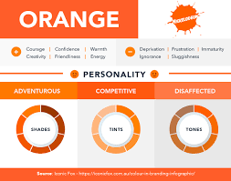
Colour psychology plays a huge role in branding, and it determines consumers’ feelings and associations with a brand. Each colour evokes a different emotional response, from confidence and serenity to excitement and urgency. For brands that want to make an impression, choosing the right colors will make quite a difference.
Think of brands like Coca-Cola, whose bright red evokes passion and energy, while for other brands like Apple, clean, minimalist white is used to signify simplicity and innovation. We’ll look at how brands are using colour psychology to tap into the emotions of their audience and show you ways to practically apply those insights to your own brand.
Whether you are building a start-up or rebranding an established company, understanding the emotions that colors evoke can help drive a deep connection with your audience through design and engagement, boosting loyalty in turn. Let’s find the right colour palette to take your brand to the next level.
The Role of Colors in Emotional Branding
One of the main aspects of emotional branding lies in the deeper, more emotionally profound connection between a brand and its audience. Understanding colour psychology is significant in forming emotional bonds.
Every time brands use certain colours deliberately, it can incite emotions which create long-lasting impressions. Red symbolises excitement, energy, and joy, as expressed in Coca-Cola. On the other hand, white, used minimally in Apple products, speaks of simplicity, innovation, and sophistication.
Indeed, in highly competitive markets, the brands that successfully used colour psychology in their branding strategies tended to remain outstanding. Emotional branding is using colours that are on point with the emotional triggers of your target audience.
For example, Starbucks uses green to represent nature, growth, and health, supporting its messaging on sustainability and quality.
A well-thought, colourful strategy associates a brand with the values and emotions of the target audience. For example, a company that wants to evoke luxury and exclusivity may opt for purple or black, as these colours are often linked to high-end products and services.
Choosing the Right Color Palette for Your Brand
Selecting the proper colour palette is one of the most significant parts of any brand’s identity. A colour palette is not just about making a certain logo or website look gorgeous; it’s about the message, values, and personality of a brand.
But first, to choose the perfect colours, you need to ask yourself a few key questions:
- What emotions do you want to evoke in your audience?
- Who is your target audience?
- How does your brand compare to competitors?
That is where choosing the right colour palette becomes important: think of successful brands like Nike. It uses black for strength and command. McDonald uses yellow and red for excitement and happiness. This kind of colour association creates a brand that is memorable, not just recognisable.
While designing a colour palette, the primary and secondary colours should be balanced. The primary color must relate to the brand’s central ideas, whereas secondary colours enhance the feel and look of the entire color scheme. If your brand has to communicate serenity and dependability, then the primary blue can be softened with any secondary grey or white color to communicate professionalism and stability.
Last but not least, consider how your colours will look on different mediums. A colour that is doing great on a website might not exactly look as great when printed; therefore, testing your colour palette on different formats is also important to ensure consistency.
Designing for Emotional Impact: Real-World Examples
Colour psychology has been employed by many businesses to convey a certain feeling to their audience.
McDonald’s
Let’s take the example of McDonald’s again and its well-known red and yellow colouration. Red provokes appetite and a sense of urgency, while yellow pertains to feelings of happiness; hence, the brand has become synonymous with families and kids.
Apple
Another good example is Apple. Using clean lines and a mostly white color palette, Apple elegantly conveys simplicity, luxury, and innovation. A design in this minimalistic style pleases the advanced tech-savvy audience that simply loves innovation and modernity.
Nike
Nike, on the other hand, uses black and gray shades to emphasize its brand’s power, strength, and authority in the sportswear market. This brand design strategy not only makes the brand instantly recognisable but also shows its commitment to environmental sustainability.
In all of these cases, the colour palette is not an afterthought; it’s a fundamental method of communication between the brand and the audience. These companies are using colours to do much more than just attract attention but to form deep emotional bonding that is beyond the product.
Common Mistakes to Avoid in Color Branding
Though colours can add immense value to a brand’s identity, colours that are not appealing have quite the opposite effect. Overdoing the colours, such as red, creates annoyance or fully upsets customers, leading to negative associations.
Another very common mistake is a lack of consideration regarding the cultural values of colours. In some cultures, white is a colour denoting purity, while in other cultures, it is a colour to mourn.
Also, not testing how your colour palette appears on various media creates inconsistencies that will damage your brand’s image. Ensuring that your colours can be translated from digital to print is crucial for maintaining the integrity of your brand design.
Conclusion
Thoughtfully chosen and consistently applied, colours can create emotional connections and heighten brand recognition, even influencing consumer decisions. Using the power of colour psychology to its full potential and effectively applying it in your brand’s design goes way beyond just good aesthetics.
Rather, it is all about creating a brand that actually speaks to something deep inside them for long-lasting loyalty and trust. If you also want to design a colour palette for your brand, you can contact Toni Hukkanen, who can help you with a smartly designed color palette so your brand can stand out, resonate emotionally, and be remembered long after by your audience.


