Mobile usage has changed the world completely in a way content is consumed online. To be exact, more than half of all browsing is done on smartphones nowadays, and that percentage keeps growing every year. Businesses, which were heavily desktop-oriented, are now turning digital brochures, catalogs, and other promotional materials into mobile-friendly versions to accommodate the smaller screen. In case such materials are hard to use or take time to load, mobile users are not going to engage and they will quit within seconds.
The transition has set a new benchmark for online brochures: they need to be quick, easy, responsive, and visually appealing. The companies, which acquire this skill, are able to engage their audiences longer and provide a better quality digital experience. In addition, they enjoy higher conversion rates, brand perception getting better, and communication flow with their mobile-first audience becoming stronger.
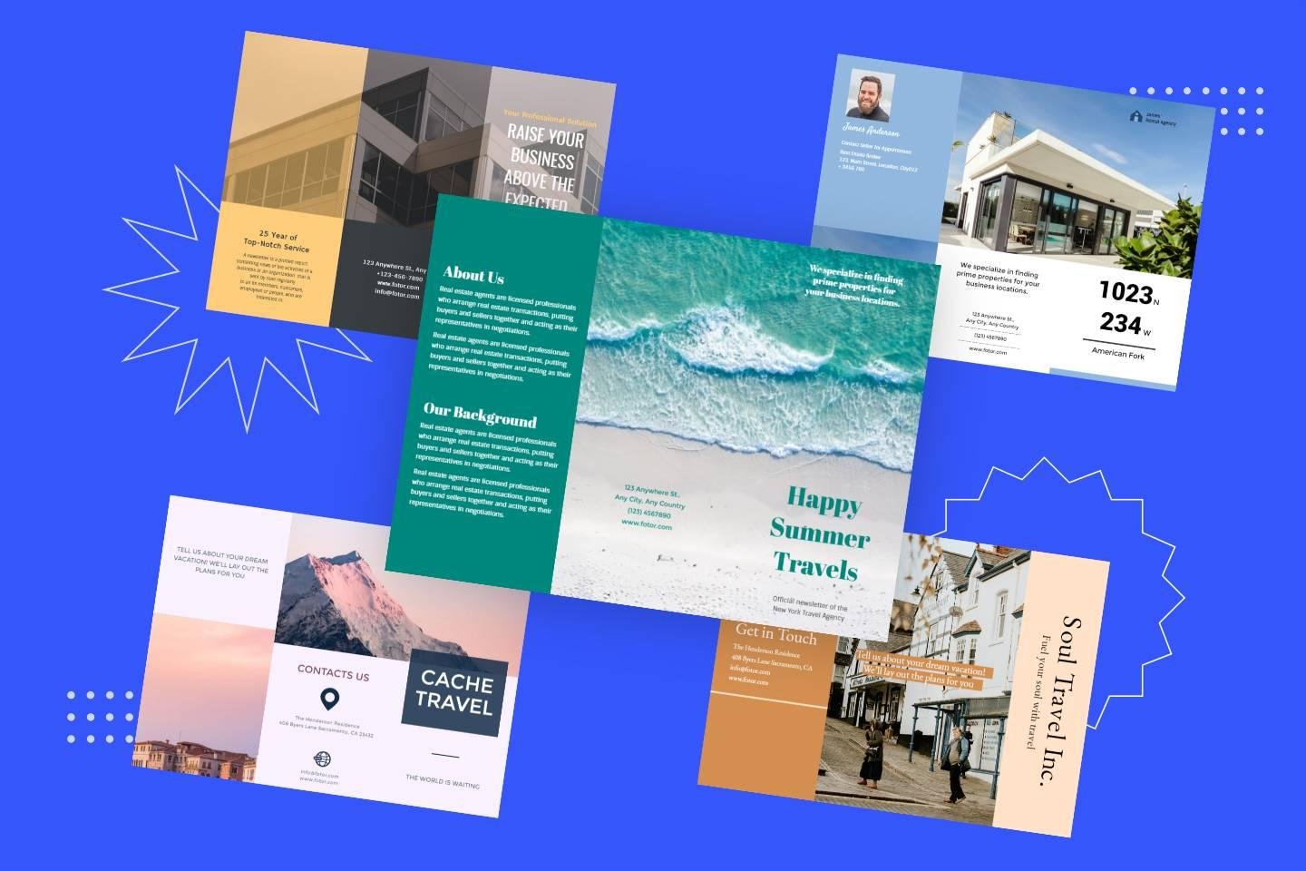
Knowing how to make online brochures attractive to mobile users is no longer voluntary. It is a strategic necessity. There is no doubt that with the increasing number of platforms equipped with advanced tools, creators have the freedom to make more interactive and user-friendly brochures without compromising the quality of the design.
Why Mobile Optimization Matters More Than Ever
Mobile users have different behavior patterns compared to desktop users. They use gestures such as swiping and tapping, quickly look through the page without actually scrolling, and anticipate that their requests will be fulfilled instantly. If there is an online brochure that is difficult to zoom in or out, to pinch, or that requires waiting, then the reader will hardly ever continue with the second or third page.
The significance of this cannot be overstated for industries such as retail, tourism, real estate, education, and hospitality that use online brochures as brand extensions. Having a mobile-friendly version is like having content that is always available, attractive, and user-friendly. At the same time, it offers businesses the possibility of getting in touch with users that are browsing while they are on the move, going to work or doing something else at the same time – the scenarios in which being quick and clear is the main thing.
After businesses have progressively aligned themselves with the mobile habits of their customers, an online brochure that is mobile-optimized is a less visible but still very effective way of gaining customer confidence and improving communication on the digital platform.
Designing for Smaller Screens Without Losing Visual Impact
Keeping a brochure visually appealing while making it mobile-friendly is among the top hardest tasks. Designs for desktops are usually made with large pictures, wide formats, and several columns, and all these things can get messy and hard to understand when a mobile screen is used to view them.
Designers have to consider different spacing, layout simplification, and image resizing so that they upload quickly without any loss of quality. Text that is nicely balanced on a big screen may become cramped if viewed on a phone unless it is adequately rescaled. So, headlines have to be still readable, and interactive elements should be of such a size that a user can tap on them accurately.
The target is to provide the same visual effect but with a lighter and more adaptable layout. Being mobile-friendly does not entail the loss of creativity, rather it is the wise use of it.
Enhancing User Experience Through Smooth Navigation
Excellent navigation constitutes the core of each mobile brochure. In case users are not able to change from one section to another in a straightforward manner, the whole digital experience is ruined. Seamless navigation involves user-friendly icons, swipe-supported page changes, and definite visual hints leading users to the content they desire.
Users ought to be allowed to move from one page to another as if it were natural, and not to be required to adjust the screen all the time. Navigation plans should be of a simple kind, sensitive to touch, and devices where mobile users think should be placed. It should be easy for users to tap on internal links and the time interval between two pages for loading should be very short.
A well-optimized mobile brochure behaves almost like a native app it feels fluid, fast, and enjoyable, encouraging users to keep exploring instead of abandoning it midway.Many creators rely on tools that simplify the production of mobile-friendly promotional materials. By using a Publitas digital brochure, businesses can produce responsive, mobile-ready brochures that adapt instantly to different screen sizes and maintain visual consistency across devices.
Prioritizing Performance: Speed, Compression, and Efficiency
Quite often, slow performance is a major factor why mobile users disengage with online materials. A flyer featuring large visuals, noncompressed files, or even a few unnecessary animations will all tend to load slowly on a weak connection. On mobile, just a two-second delay can result in a considerable drop of the engagement level.
Performance optimization is essentially about striking a balance between quality and speed. It is advisable that pictures be compressed, fonts should be of a lighter nature, and scripts should be written in such a way that every page is loaded in a minimum of time. The lower the total file size of a brochure, the better will be the user experience.
They want the content to be available immediately after their request. A mobile-optimized brochure is considerate of their time, it loads quickly, and it delivers all the necessary pieces of information without any interruptions.
Using Interactive Elements Thoughtfully
These days interactive features can make digital brochures amazing, however on mobile devices they have to be kept at a minimum. Buttons, sliders, embedded videos, or clickable icons can make the experience wonderful, but the excessive interaction can make the user to be overwhelmed. Touchscreen navigation still has its limits, and if there are too many complicated elements the user will be frustrated instead of engaged.
Great online brochures use interactivity as a tool to tell the story and not as a distraction. Just a product zoom, a brief embedded video, or a spotless transition can be enough to raise the content to a new level. Interaction should be the tool by which the reader is led, thus it should be easier to deal with the material, not harder.
Correctly employed, interactive features are a source of faster understanding of the information for users, and they also create an emotional connection with what they are viewing.
Crafting Text for Mobile Readability
The manner in which reading is done on a mobile screen differs substantially from paper or a desktop. If the text is very small or too tightly packed, it can become tiring just to follow it. A huge paragraph can scare off a reader, and if the spacing is not consistent, it can make the reading flow harder to follow.
Brochure writers have to make their content suitable for the mobile users. Shorter paragraphs, proper spacing, and clearly understood headline sections are some of the things that help the reader to have a smooth reading experience. Fonts should be such that they can be easily read, and the contrast between the background and the text should be strong enough so that the eyes do not get tired.
This method does not simplify the message but merely makes it more accessible. When readability gets better, engagement also goes up by itself.
Ensuring Accessibility and Inclusivity
Accessibility is definitely not a design option, it is an integral part of the process of creating digital materials that anyone should be able to use. A mobile-optimized brochure must take into account the users that may be looking for assistive technologies, those who have visual impairments, or those who might need text-to-speech features in order to read comfortably.
Proper contrast ratios, alt text for images, screen-reader-friendly formatting, and easy navigation layouts are some of the ways through which everyone can access and use the brochure. In fact, most organizations today consider accessibility as their ethical and legal obligation, thus, it has become a significant part of the optimization process.
Where a mobile brochure is accessible, it is able to extend its reach to more people, facilitate the inclusion of different groups of people, and enhance the brand’s image.
Final Thoughts
Making online brochures accessible and user friendly for mobile users is one of the vital moves in digital publishing today. As mobile usage keeps on increasing, businesses that are slow to adapt will lose a lot of engagement and possible conversions. A mobile-optimized brochure that works well on different devices is not just a PDF with changed dimensions; it is a digitally created experience that takes into account the limitations and mobile user behavior expectations.
When companies focus on clean design, smooth navigation, quick loading, readable text, and valuable interactivity, they can produce brochures that look like they are from the future, are professional, and is a pleasure to use. The money spent returns in stronger engagement, better brand perception, and more effective communication with on-the-go audiences.